How to mix patterns in interior design
How to bring an interior scheme to life with checks, florals, stripes and geometrics…
Main image: ILIV
Pattern is one of the simplest ways to bring personality and character into a home, yet it’s often the element homeowners are most nervous about getting wrong. Used with confidence, pattern can transform a scheme from flat to fabulous. The secret, as with any great interior, lies in three things: colour, scale and balance.
Here’s the ultimate guide to decorating with pattern, from your first tentative cushion to a fully layered, statement-making room.
Start Small with Patterned Accessories
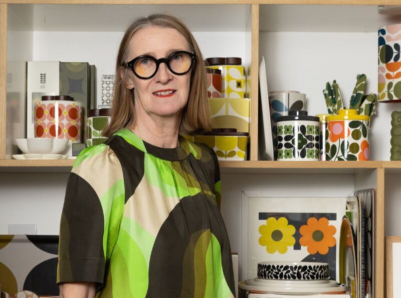
If you’re new to decorating with pattern, ease in with accessories rather than furniture. Cushions, vases and tableware are the lowest-risk, highest-impact way to experiment. Even a curated collection of patterned mugs or ceramics can create an eye-catching display on open shelving. Once you feel confident, you can start introducing larger patterned pieces such as armchairs or window seats.
Pictured: Joules at DFS, Sophie Allport, Moon
Choose a Hero Pattern First
Every well-planned patterned room needs a starting point. A statement wallpaper, rug, sofa or upholstered headboard makes the ideal hero pattern; the anchor around which the rest of the scheme is built. From there, choose complementary patterns and accessories that echo its colours, creating a cohesive, layered look rather than a haphazard mix.
Pictured: Sophie Allport, ILIV, Moon
Combine Different Pattern Styles with Confidence
Don’t be afraid to mix pattern types within the same room. Some reliable pairings interior designers return to again and again:
- Soft florals with bold geometrics — for contrast without clashing
- Classic stripes with checks or abstract prints — a timeless, tailored combination
- Large-scale prints with smaller, detailed patterns — to create rhythm and visual interest
The unexpected contrast between styles is often what makes a scheme feel considered rather than matchy-matchy.
Pictured: Walls and Floors, Ca’Pietra, Tileflair
Tie It Together with a Shared Colour Palette
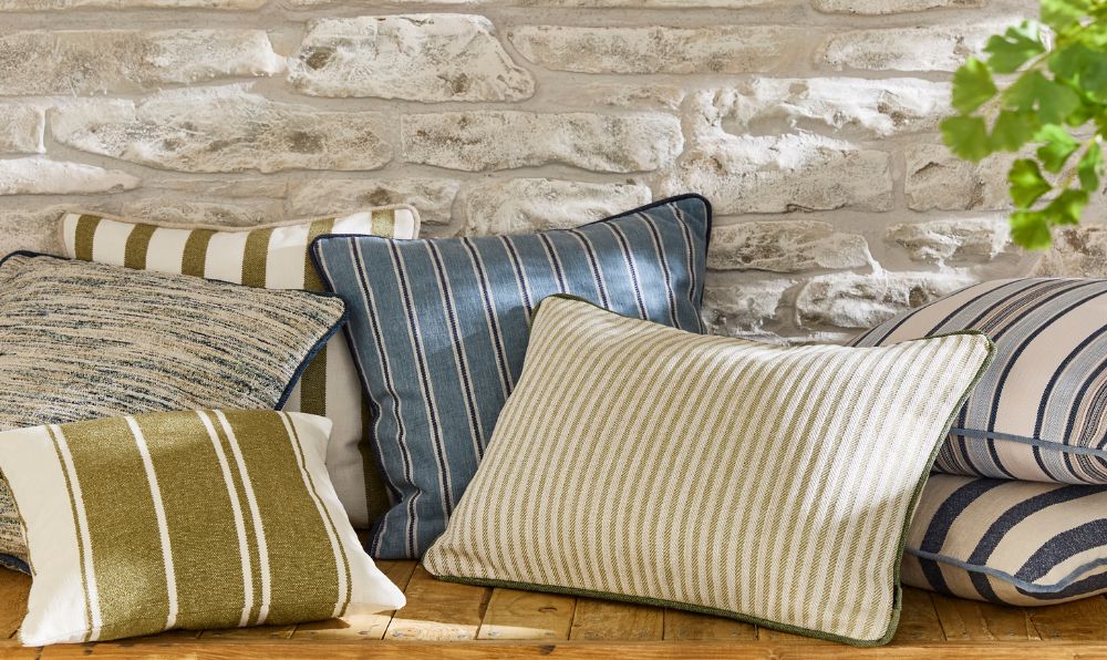
The golden rule of mixing patterns: keep them within a common colour palette. Florals sit happily alongside stripes or checks when they share similar tones. Pick out either the background colour or an accent shade across each pattern to create a cohesive, pulled-together look — even when the motifs themselves are very different.
Pictured: ILIV
Mix the Scale of Your Patterns
Varying pattern size is what stops a scheme from feeling flat or overwhelming. A well-balanced room typically combines:
- One large-scale print (the hero)
- A medium-scale supporting pattern
- A smaller, more detailed accent pattern
This layering prevents patterns from competing for attention and gives the eye a natural sense of hierarchy.
Avoid Overwhelm: The Rule of Three
As a general starting point, limit yourself to around three main patterns per room, balanced with plenty of plain fabrics or solid surfaces to give the eye somewhere to rest. It’s a common misconception that large-scale patterns are riskier, but in fact, they often read as calmer than a room full of small, busy prints.
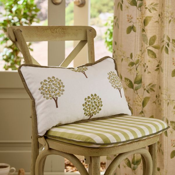
Pictured: ILIV
Think About the Mood You Want to Create
Pattern doesn’t just decorate a room, it sets the atmosphere.
- Bold, graphic designs bring energy and personality to dining rooms, kitchens and home offices.
- Subtle botanicals and gentle stripes create a calmer, softer feel suited to bedrooms and relaxed living spaces.
Choosing pattern with mood in mind ensures your scheme feels right for how the room is used.
Subtle Ways to Introduce Pattern Without Print
Pattern doesn’t always have to be printed. For a softer, more understated take, consider:
- Embroidery and quilting
- Woven fabrics and natural materials
- Embossed finishes
- Vintage textiles and faded prints
These tactile, textural approaches add visual interest with a gentler, more relaxed feel than bold prints.
Update Patterned Accessories with the Seasons
Swapping out patterned accessories is one of the easiest ways to refresh a home throughout the year:
- Spring/summer: fresh florals and lighter colours
- Autumn/winter: plaids, rich jewel tones and deeper hues for warmth
Pictured: Sophie Allport, Cullifords